Logos, colors and one alien.
Logos, colors, type and the rules. Take what you need, and keep Blip in one piece.
ZIP, 2 MB: logos, avatars, banners and favicons
Meet Blip
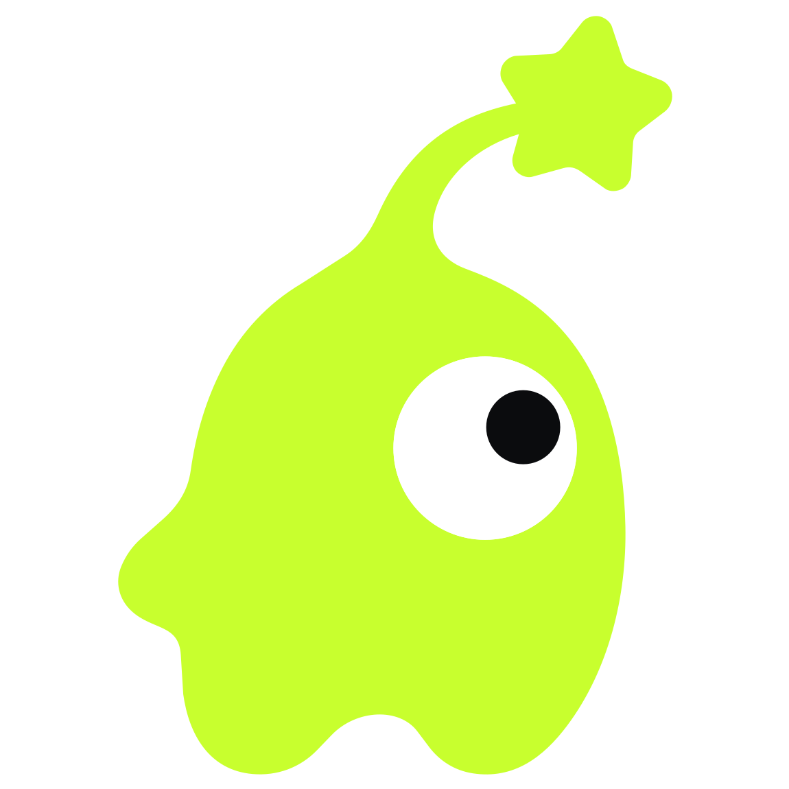
Blip is a one-eyed alien with a star on its antenna. It showed up when we rebranded and never left.
Move your mouse. Blip is watching.
Blip is always one solid shape with one eye. Don't give it a second eye, a mouth or accessories, and don't redraw it.
- A star on the antenna
- Exactly one eye
- One solid shape


Colors
Ink, paper and lime do the heavy lifting. Cyan, magenta and orange are for illustrations and data, never for buttons.
Click to copy
Typography
Each font has one job. All three are free under the SIL Open Font License.
Unbounded
Headlines and the logo, weight 800
Good code. Bad influence.
Manrope
Body copy
We design, build and look after software for companies that want it to hold up.
JetBrains Mono
Labels, buttons, numbers and code
$ git push origin main
The tagline
It's also a formula. Every product swaps in its own first word, and 'Bad influence.' never changes.
English
Good code. Bad influence.
Czech
Dobrej kód. Špatnej vliv.
- steezrGood code. Bad influence.
- studioGood apps. Bad influence.
- cloudGood clouds. Bad influence.
- aiGood models. Bad influence.
- opsGood ops. Bad influence.
Using the logo
Clear space
Keep at least one x-height of empty space around the logo. That's the height of a lowercase e in the wordmark.
Minimum size
The horizontal logo stays at least 120 px wide on screen and 25 mm in print. Anything smaller gets Blip on its own.
Do
Use the SVG files exactly as they are.
Put the lime logo on dark grounds and the ink logo on light ones.
Don't
Stretch, rotate or recolor the logo.
Retype the wordmark in another font.
Add shadows, outlines or gradients.
Move Blip to the other side of the word.
Missing something?
Press, partners and designers: tell us what you need and we'll send it over.